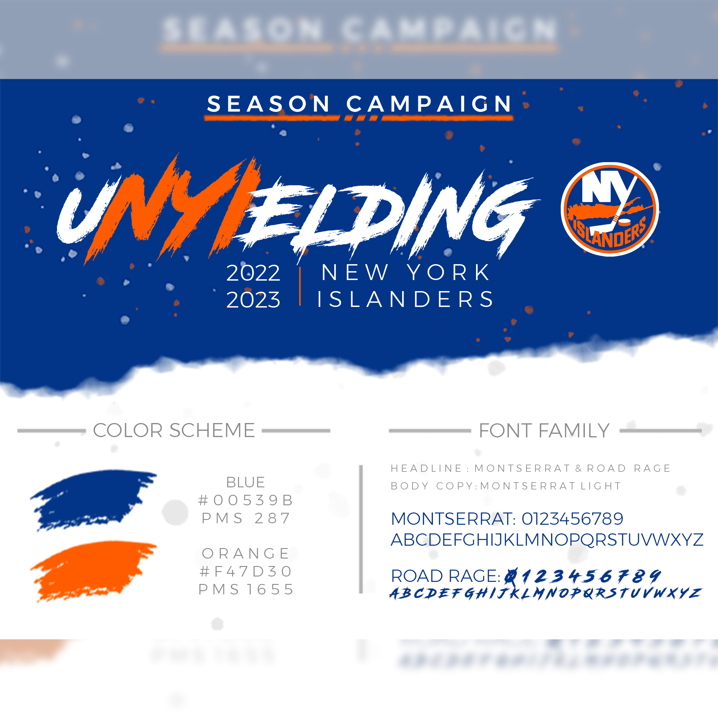
The main infographic detailing the branding for the upcoming season, including color scheme and font family.
The "NYI" in "uNYIelding" is one of my favorite touches and can describe the Isles well.

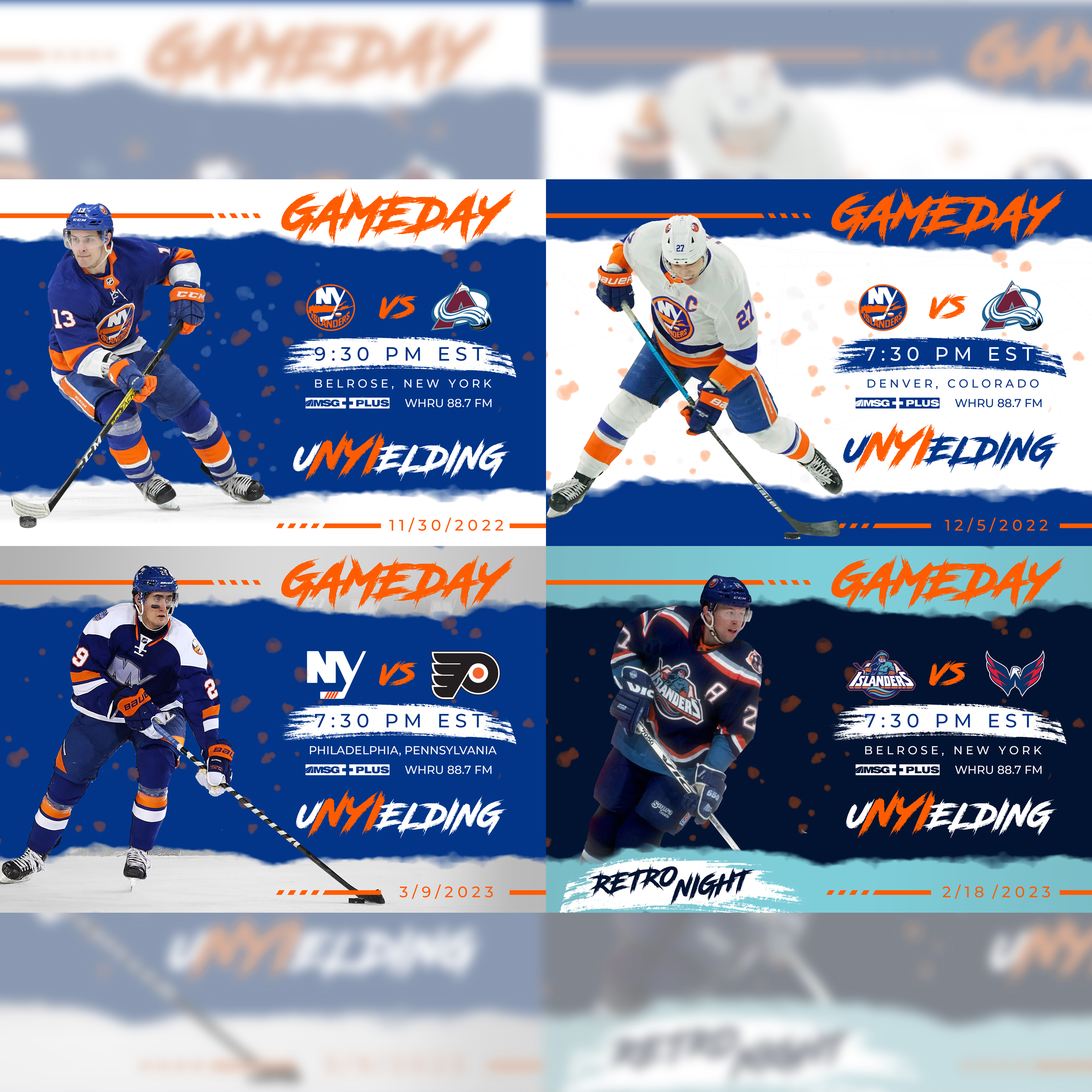
A set of four game day graphics, one each for (clockwise) home, away, retros, and thirds.
All information is presented to the reader in a clear and concise way while still showing branding, colors, an sponsorship.

Happy Birthday graphic for when it's the player's birthday.
The painted brush stroke theme on torn paper continues here.

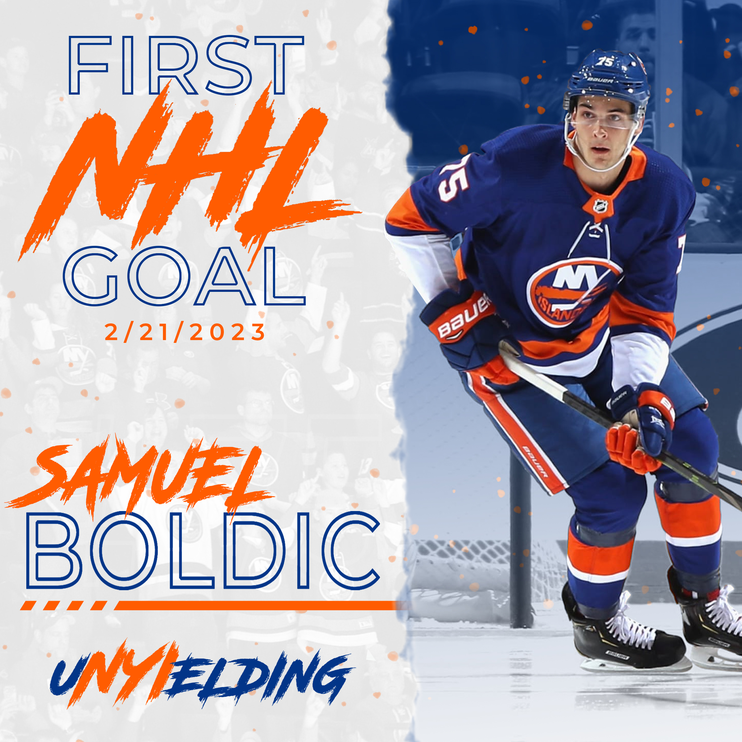
A First NHL Goal graphic, for when players score their first professional goal.
Please note that the orange broken bar is often used to "carry in" information, and is borrowed from the Isle's logo.

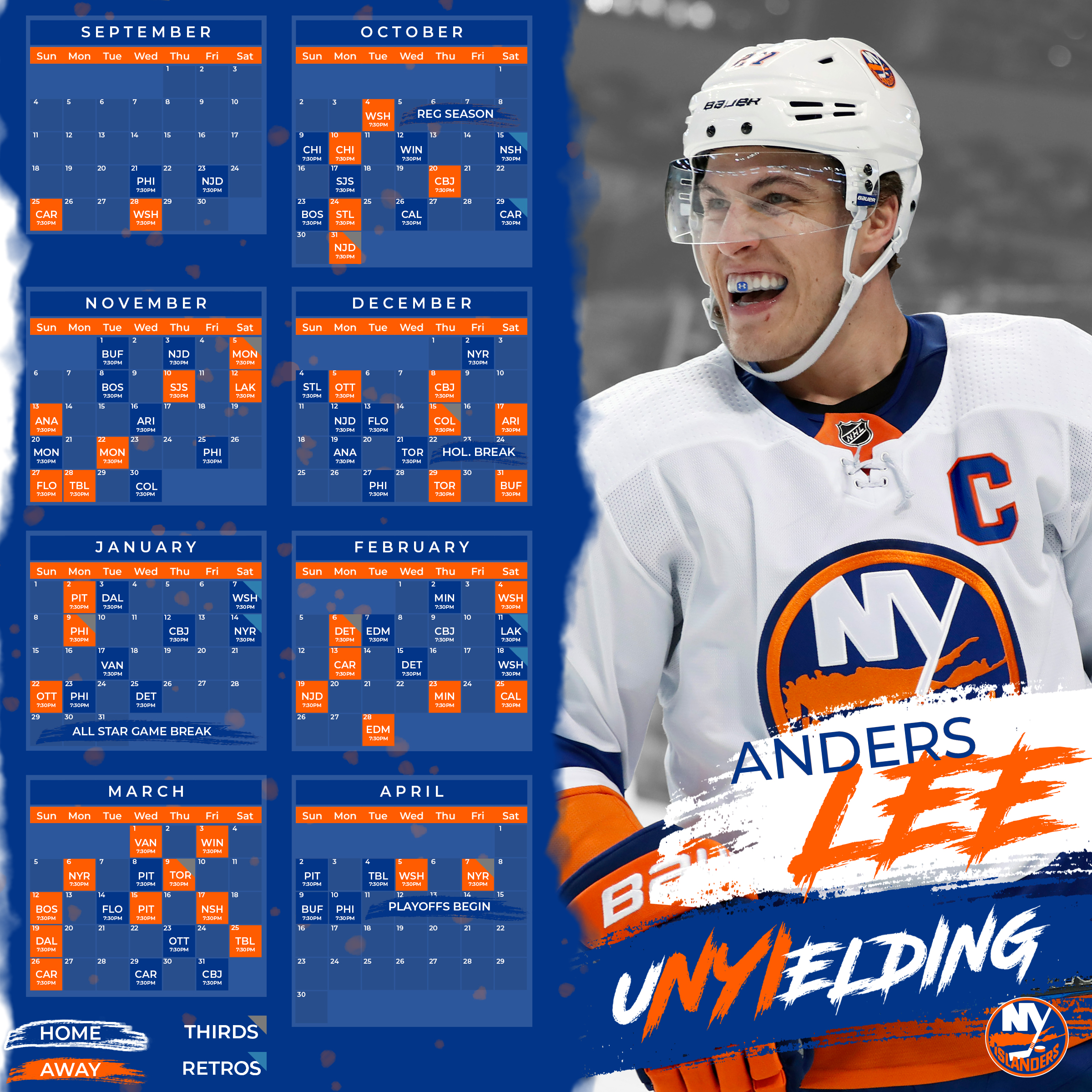
The Islander's upcoming schedule, presented cleanly while showing off the entire season.
It shows which games are home, on the road, and when the team is wearing their third or retro jerseys.

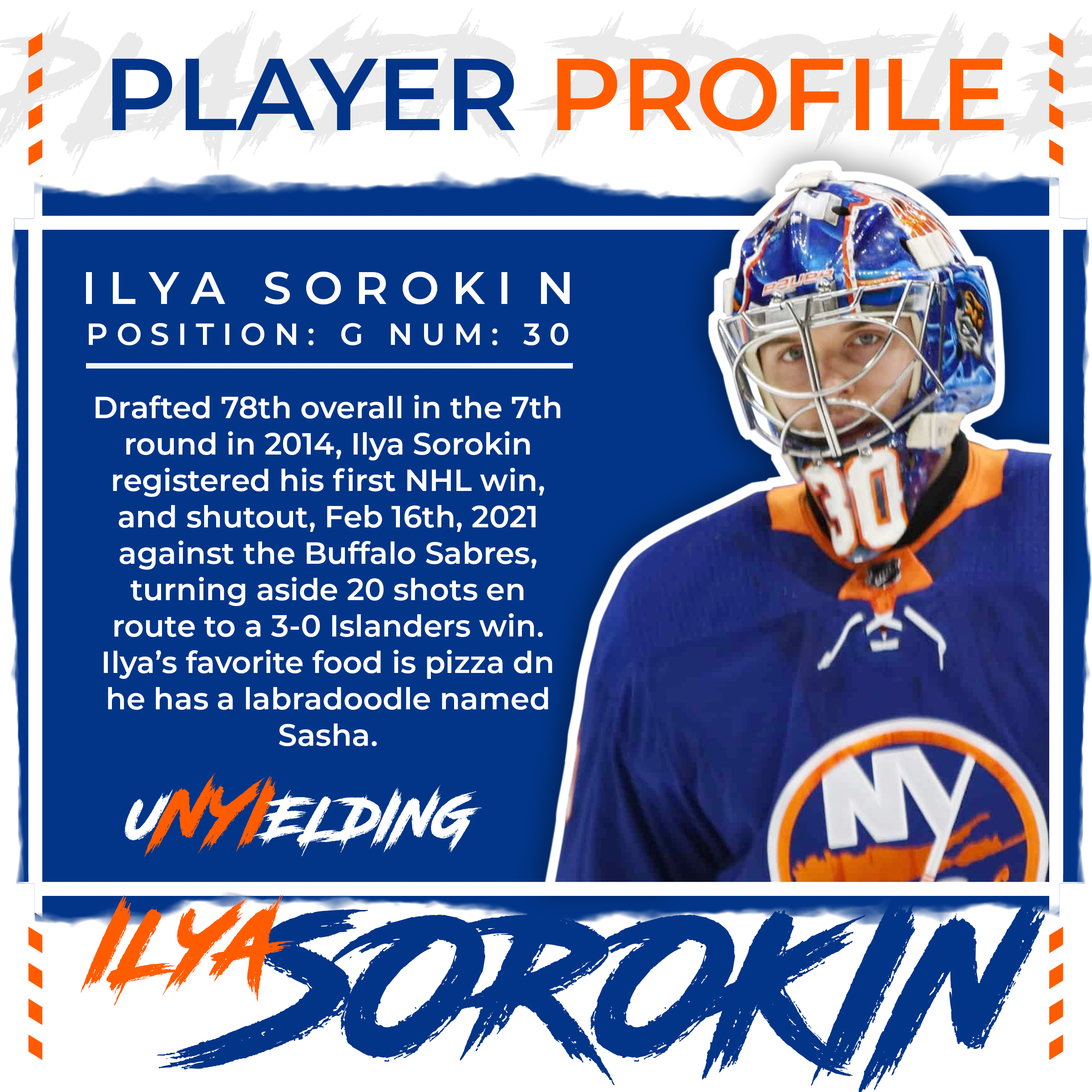
A Meet-The-Player type graphic, where the player takes center stage and some fun trivia is shared.

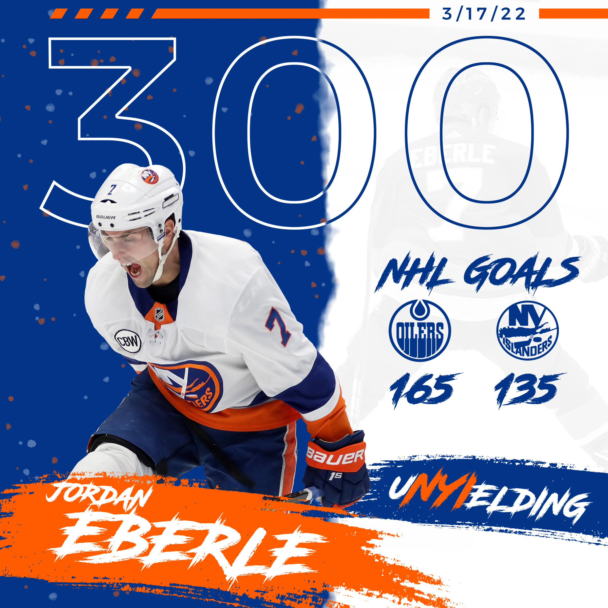
A Milestone graphic, showcasing when a player hits a big accomplishment in their career.
The milestone is showed just above the their relevant stats, with the date of the milestone up top.

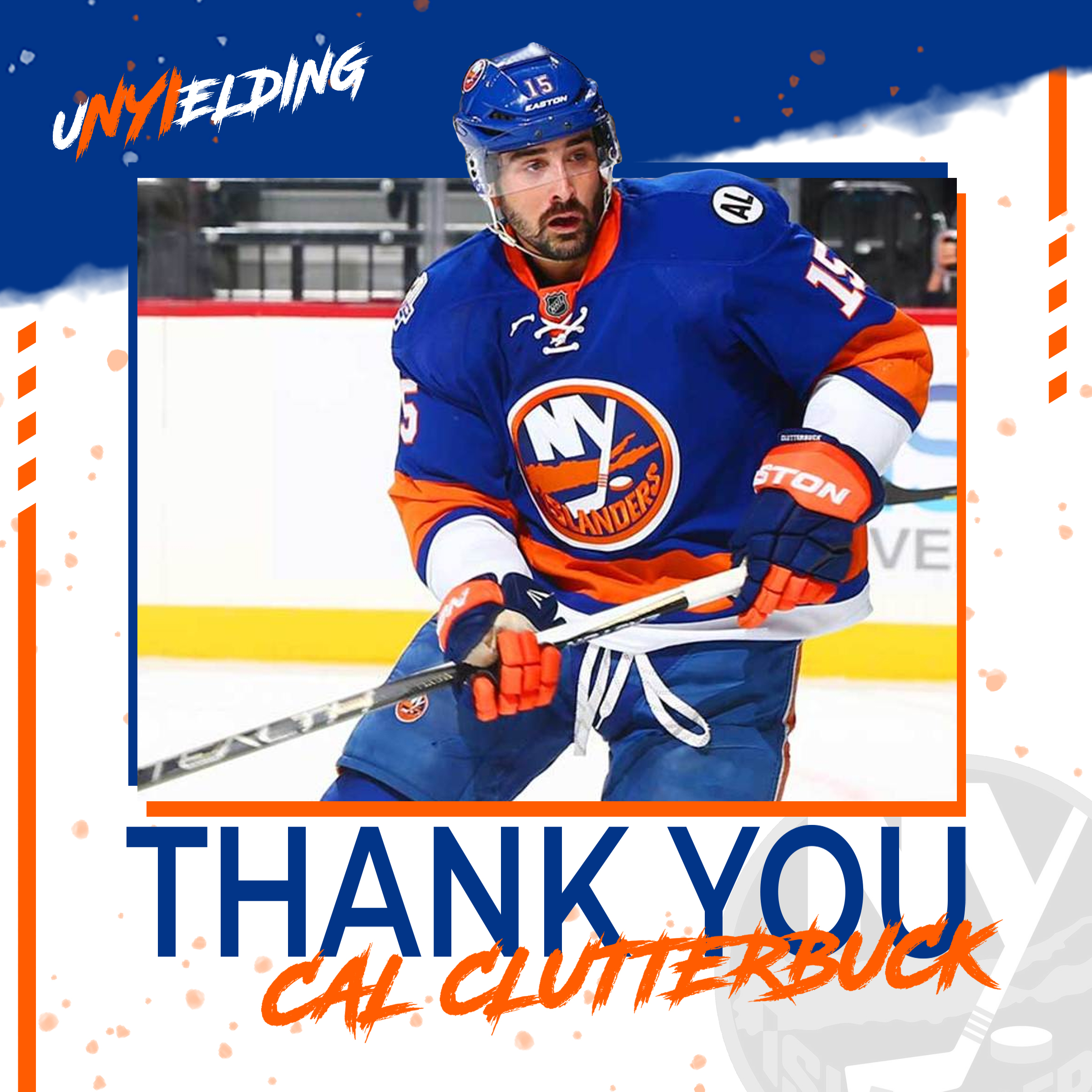
A Thank You graphic for a player that is no longer on the team due to a trade, retirement, or other reasons.

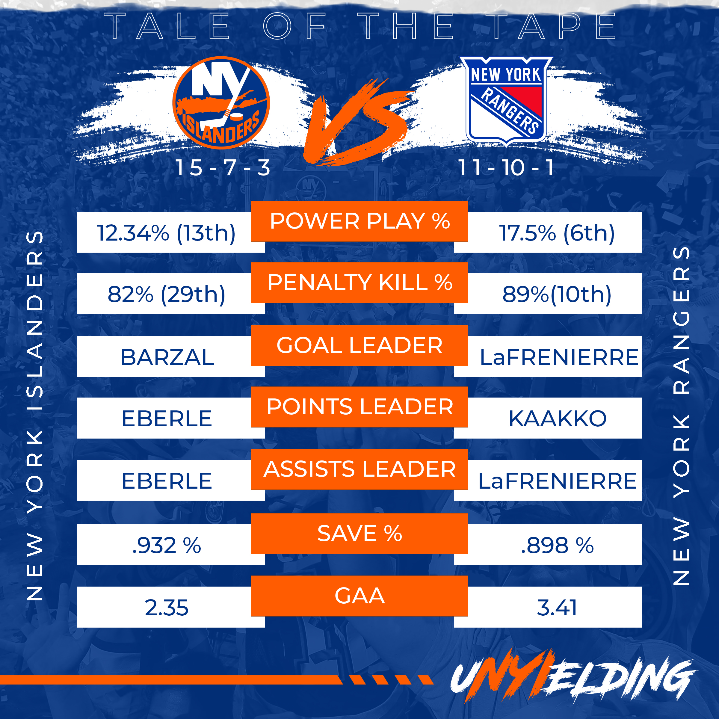
A Tale Of The Tape Graphic comparing the two teams that night.
It displays which teams are playing and a head to hea matchup of their team stats.

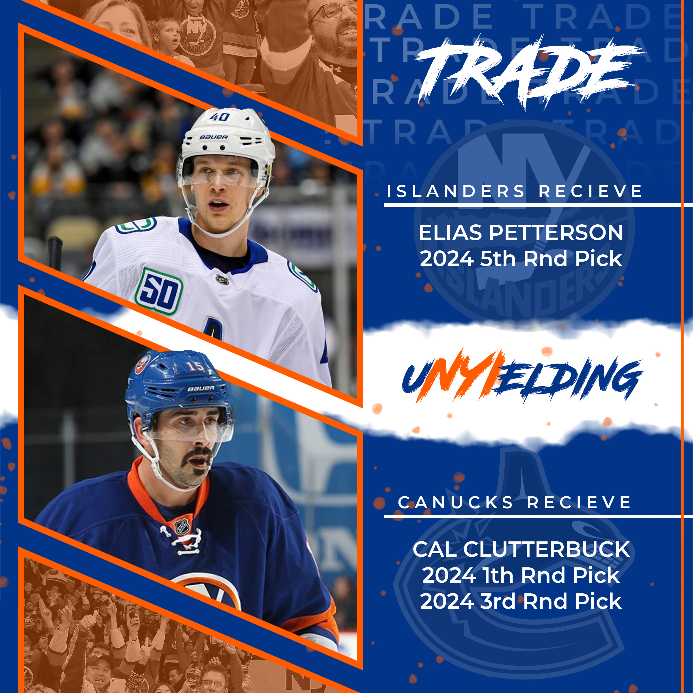
A Trade graphic for when a player or assets are traded for each other.
The broken orange stick takes prominence here, to showcase which players are being moved.

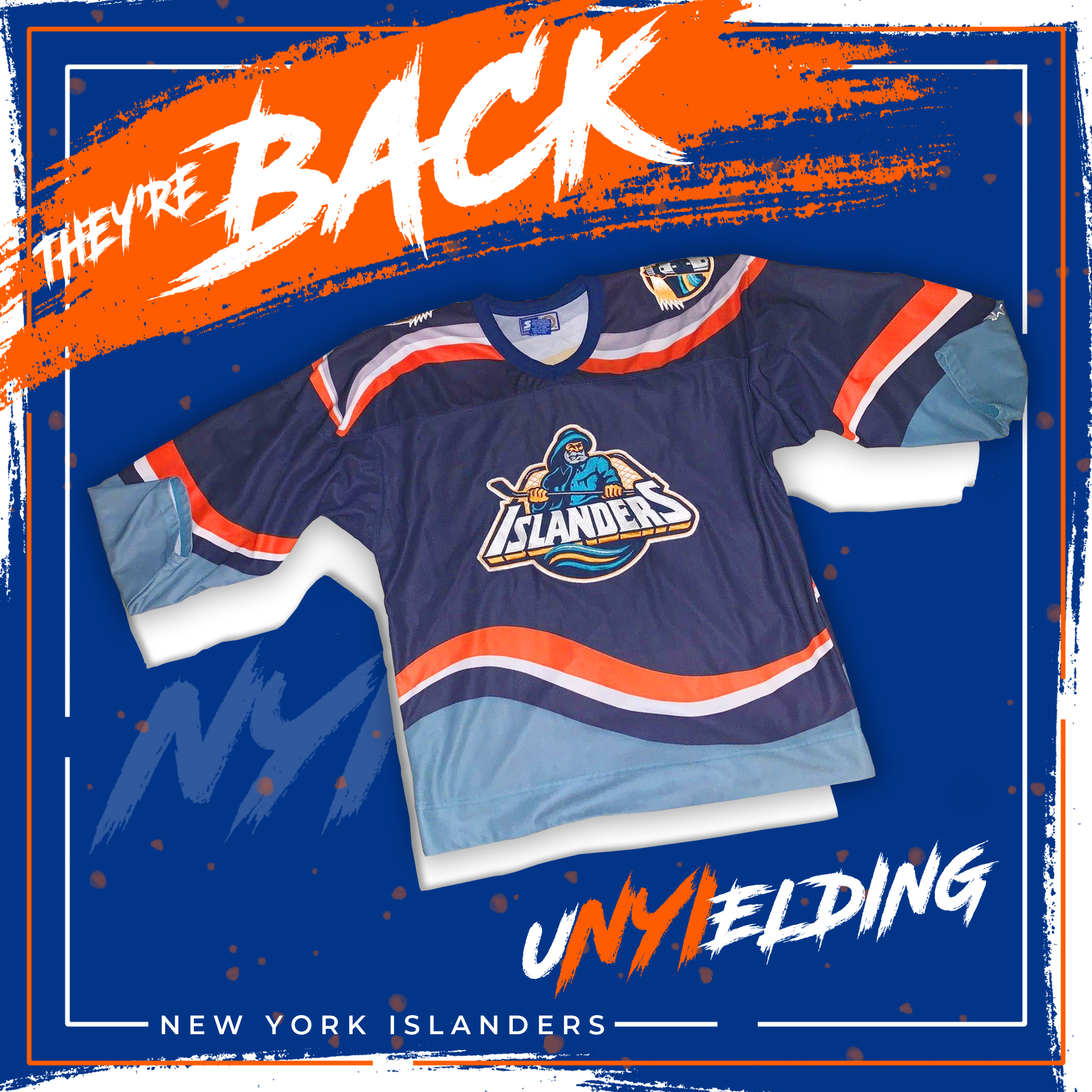
A Celebratory graphic showing that the old "Fisherman" style retro jerseys are making their way back into the rotation.
